Customizations of Chart Widget
Introduction
You can customize your chart widget according to your needs.
Glossary
Data source
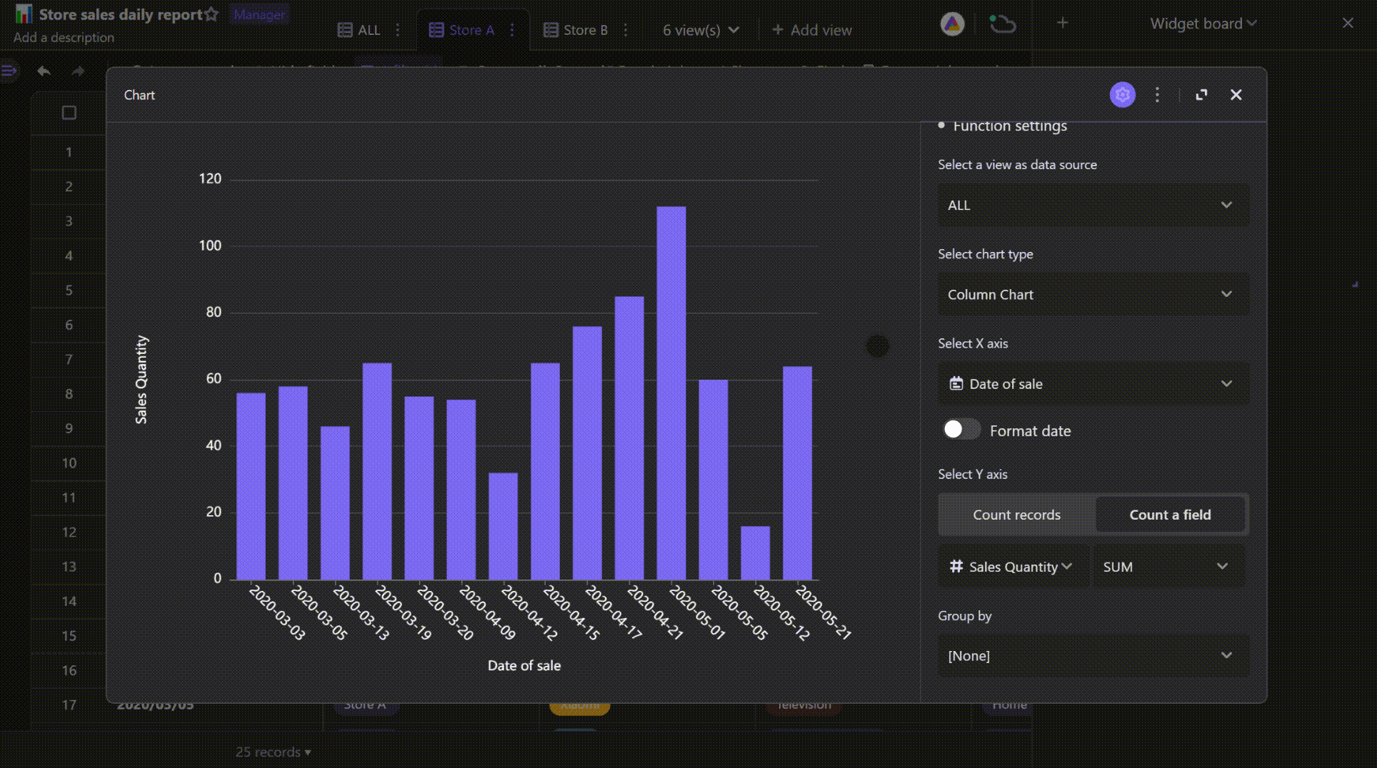
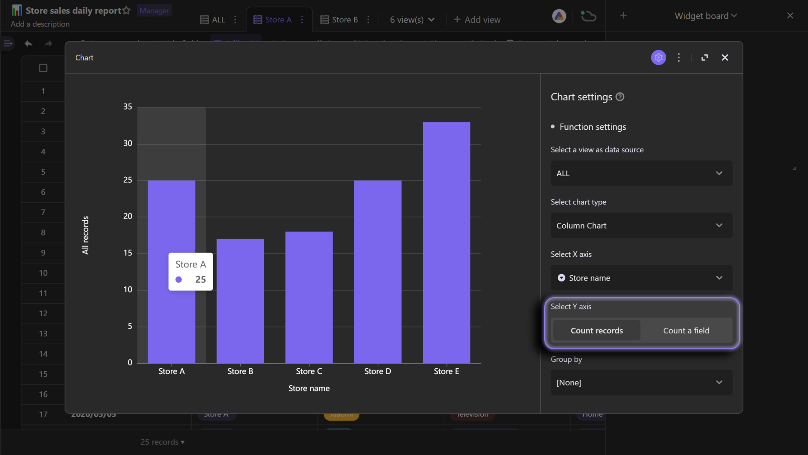
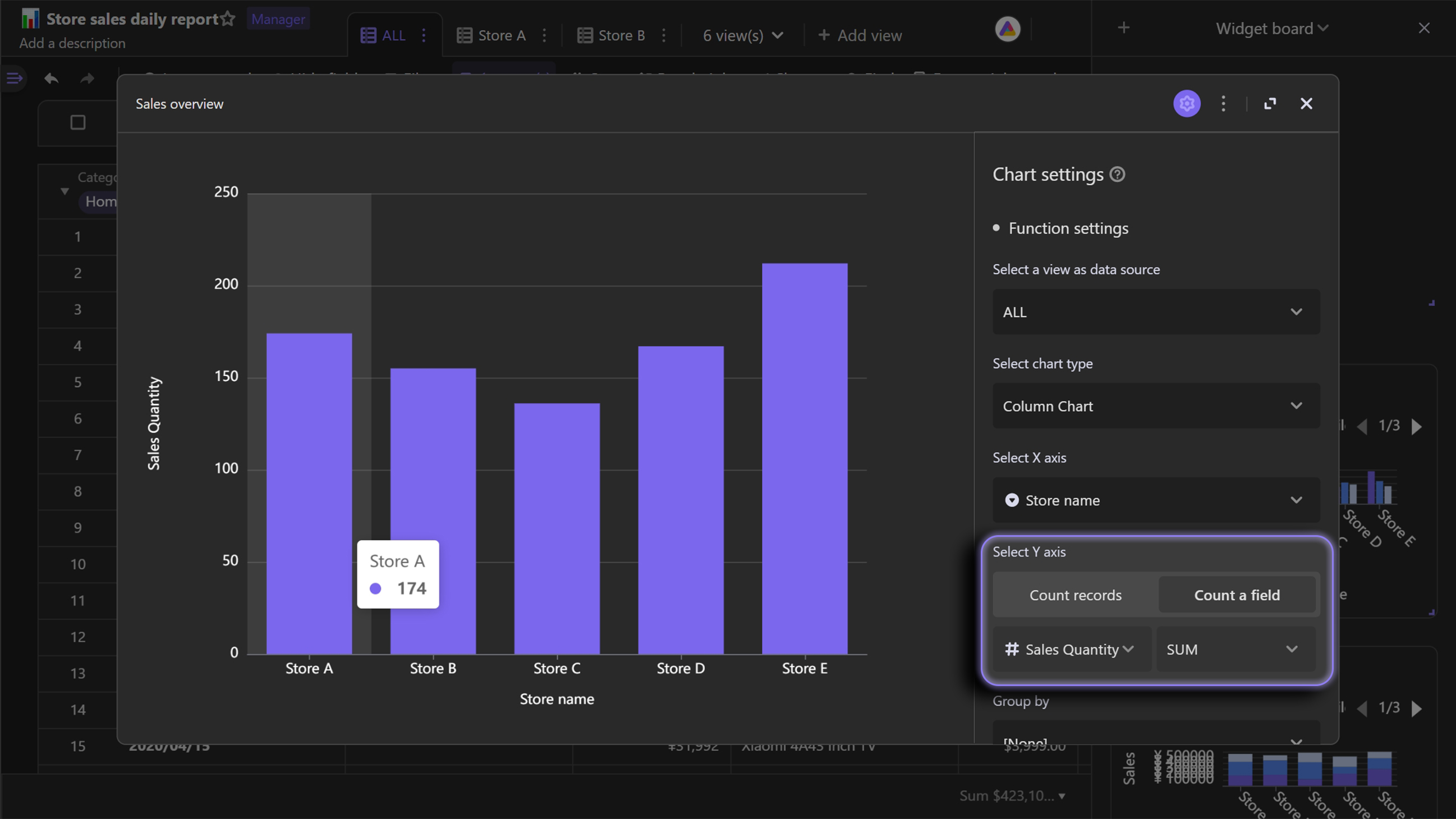
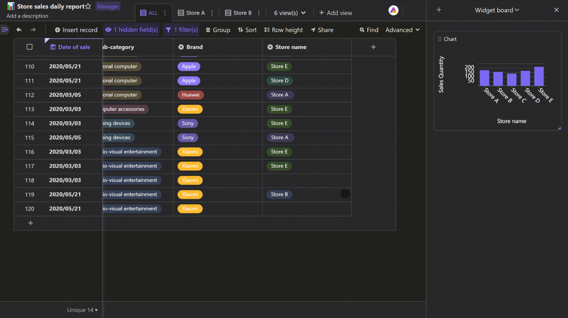
You need to select a datasheet or view you wish to visualize as data source for chart widget.View
Based on a datasheet, you can generate multiple views. To display different data on different views, you can customize the views with filtering, sorting, and grouping.Chart Type
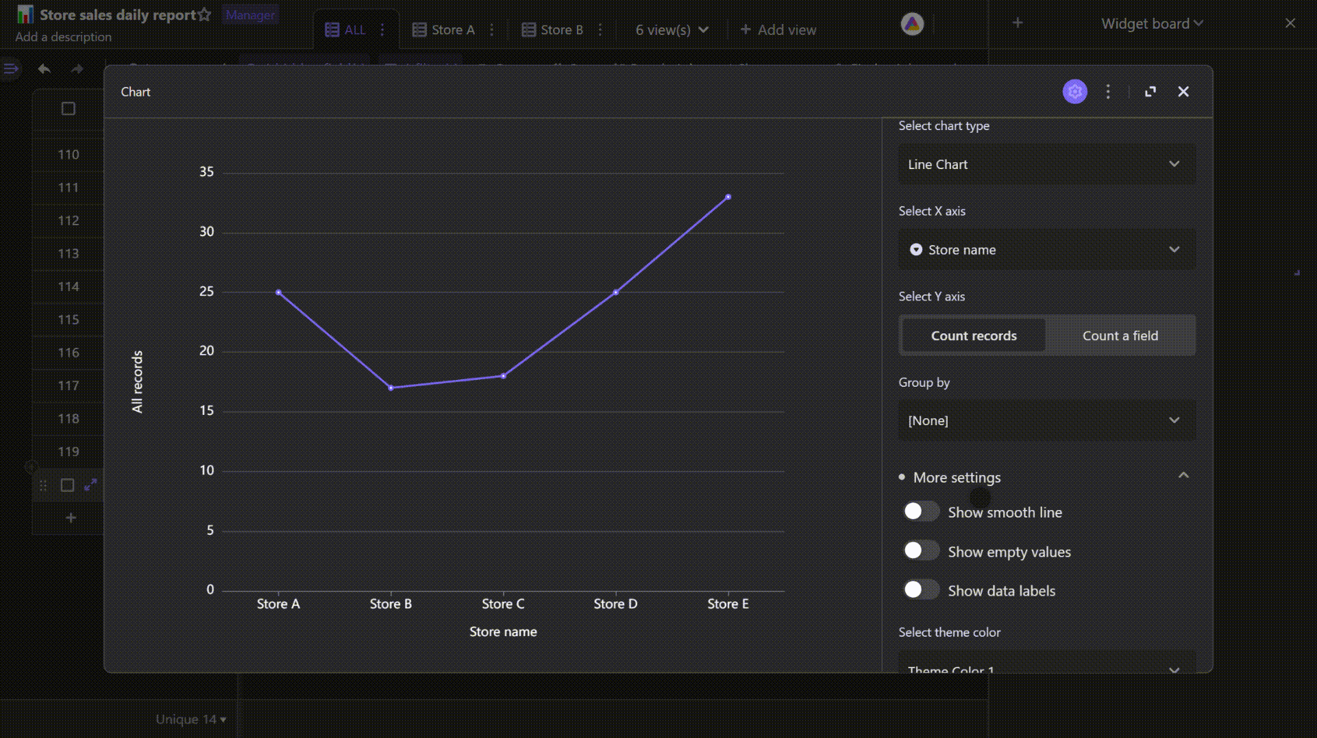
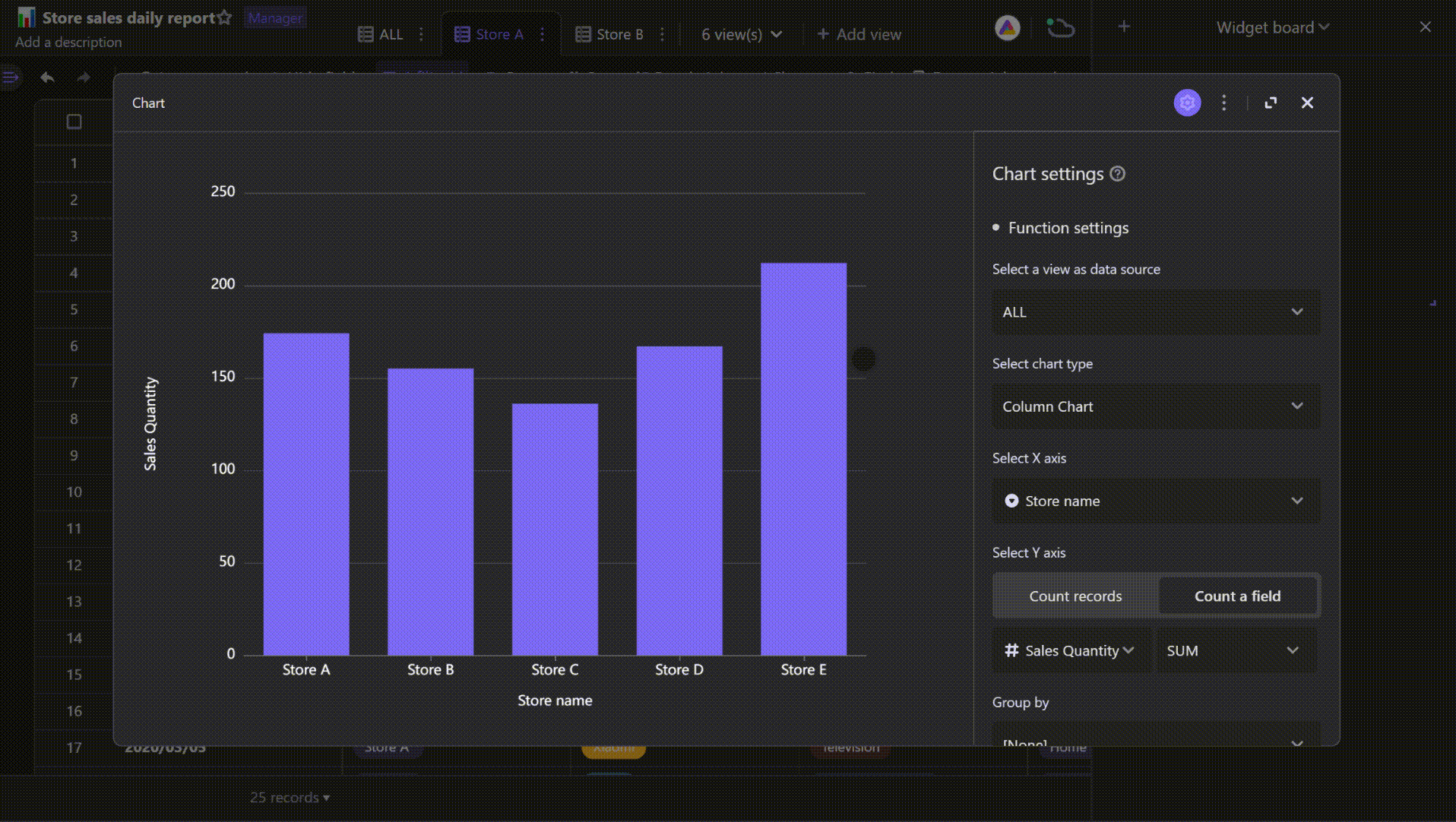
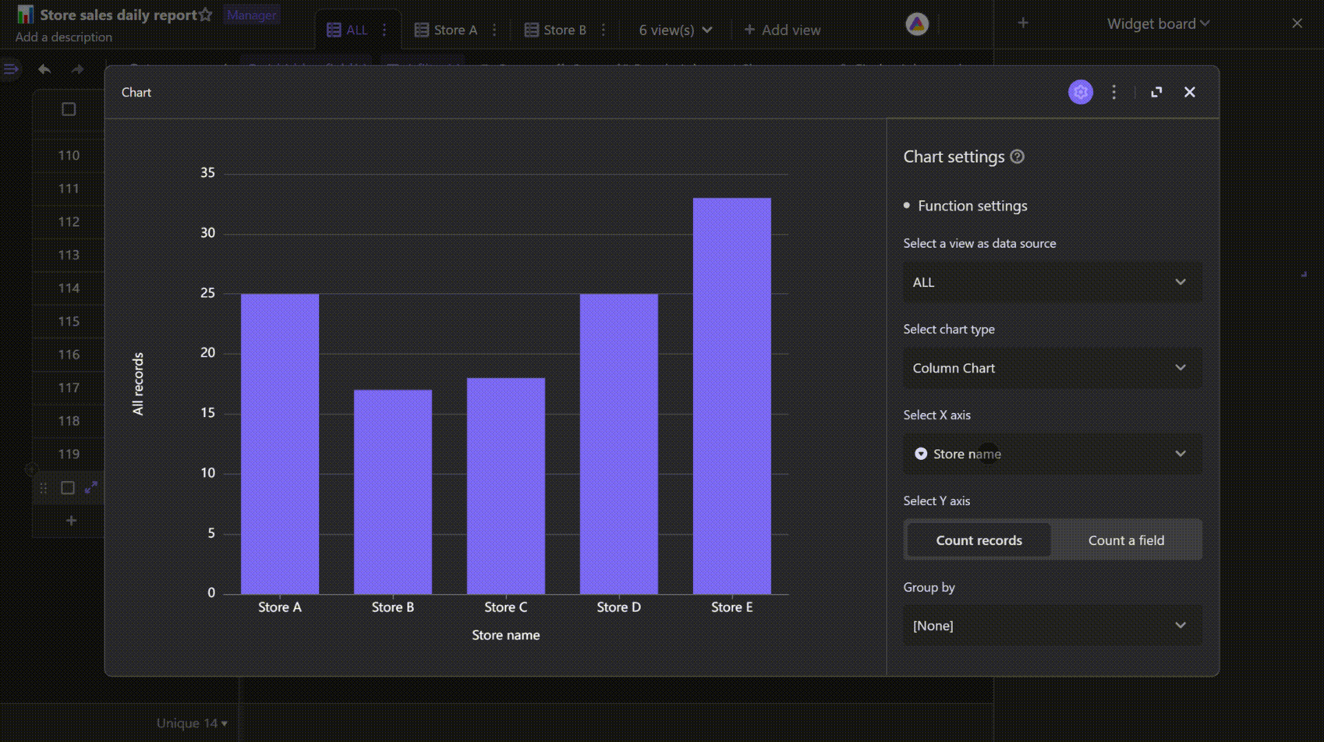
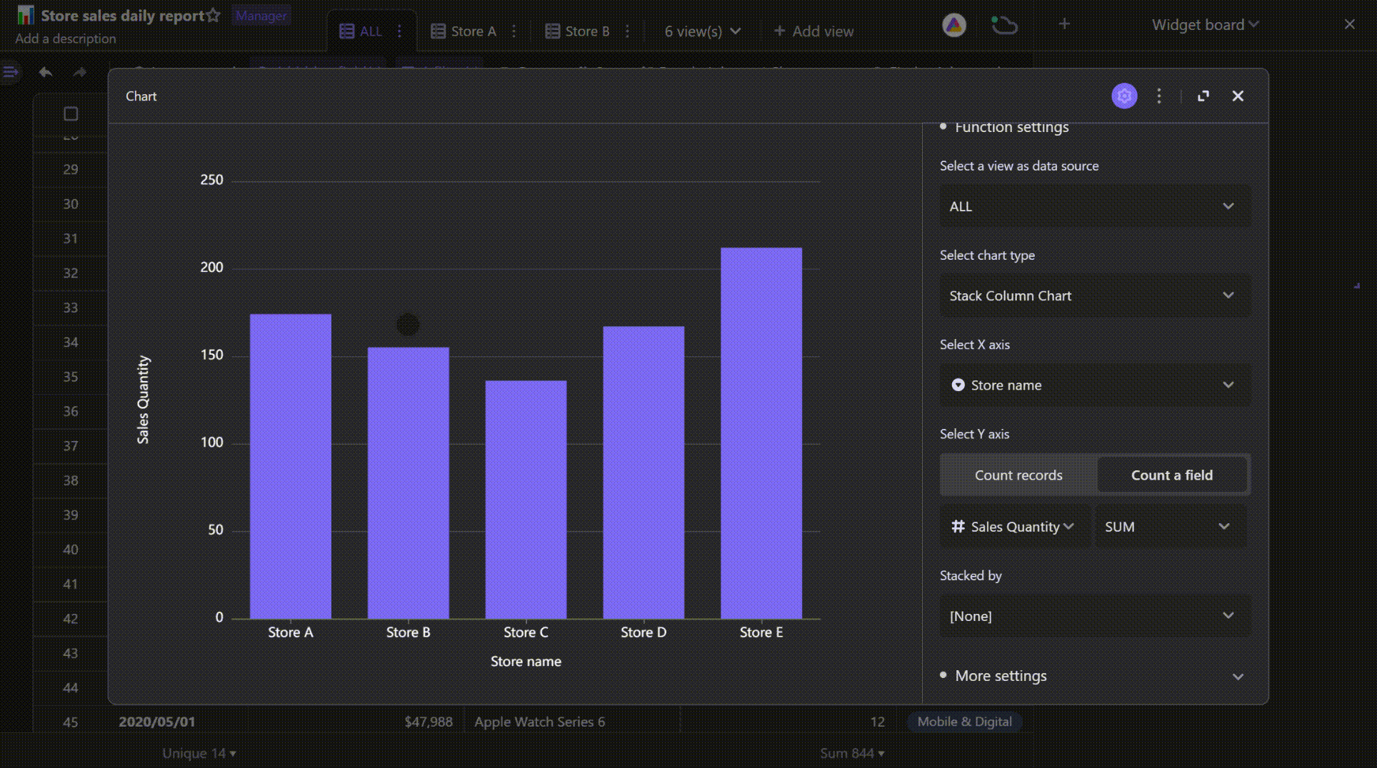
There are multiple chart types provided for you to use in many cases.X-axis
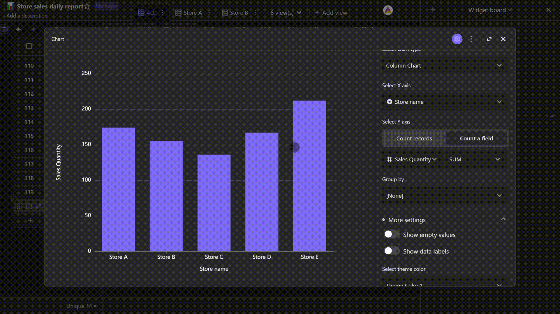
You need to pick a field for your chart's x-axis.Y-axis
Quantities of each X values. You need to pick a numeric field for your Y axis.Record
Each row of data in the grid view of the datasheet is called a record.Field
Each column of data in the grid view of the datasheet is called a field.Group by
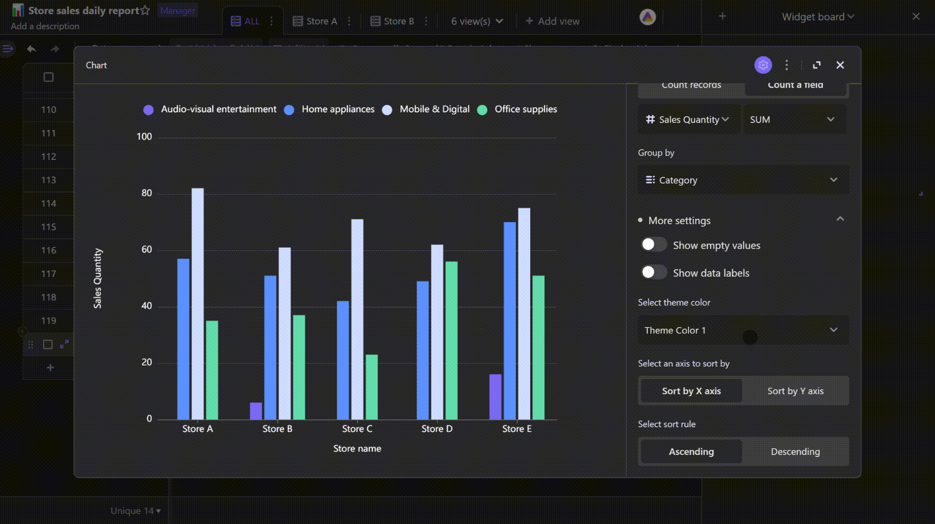
You can choose to make your X values are plotted as groups, with picking a third field to group by. For example, if you own several fruit shops, to know the quantities of each type of fruit in each shop, you can pick store name field for X axis and fruit name field to group by.Aggregate values
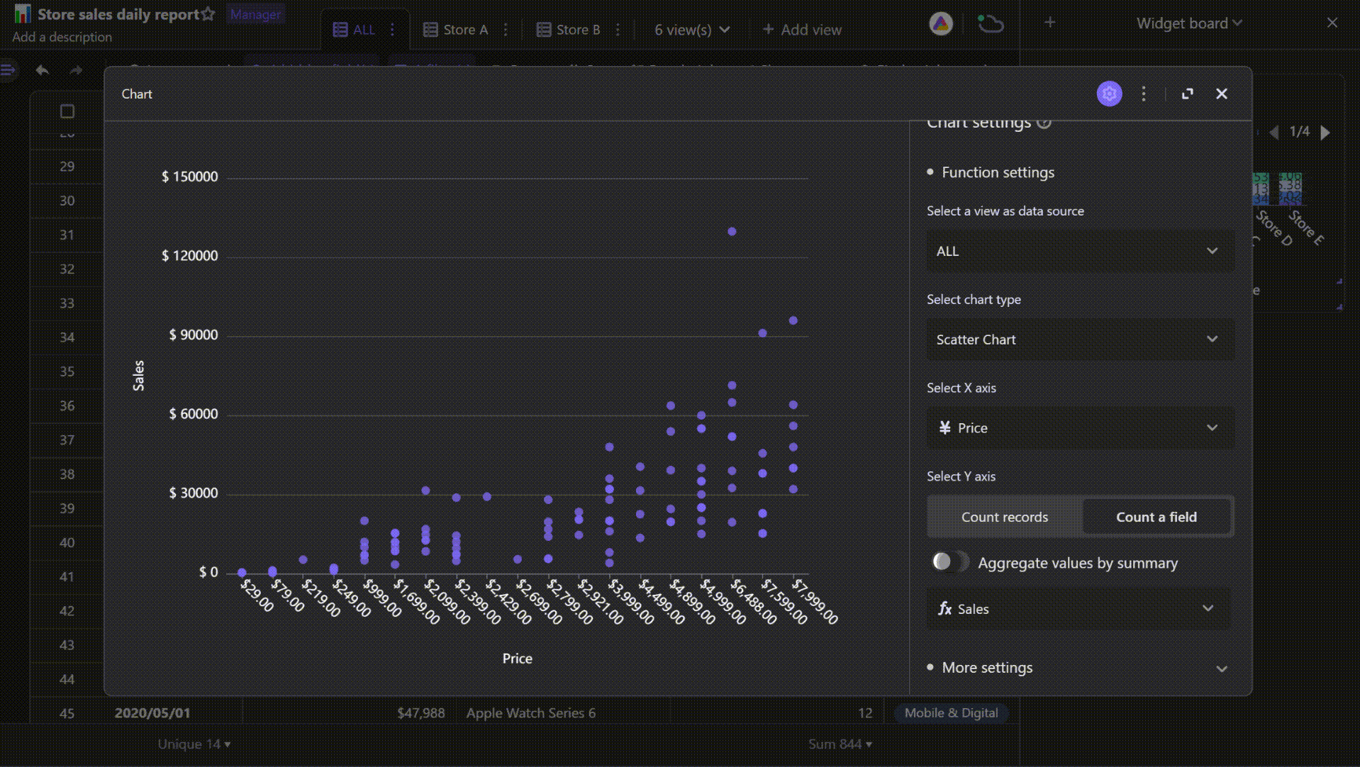
For scatter plot, you need to toggle on the option of aggregating values with selecting a summary function performed on the field. The types of summary function include sum, average, maximum, and minimum.
How to configure a chart widget
Selecting a view
Select a view you want to visualize as data source.
Selecting a chart type
There are a variety of chart types from which you can pick, including column chart, stacked column chart, percent stacked column chart, basic bar chart, stacked bar chart, percent stacked bar chart, pie chart, donut chart, basic line chart, stacked line chart, and scatter chart. You can pick the right type chart to analyze your problems.
Picking a field for X-axis
You can choose any field for X axis except the attachment field.For below field types, you can set up more details.
Date field: You can reformat date.
If the field you select is date type, you'll have an option of reformatting the date values as Year-Month-Day, Year-Week, Year, etc.
Multi-select field: You can split multiple values.
If the field you select is multiple choice type, you can toggle on the split multiple values option to display each choice on the plot.Fields of multiple choice type include multi select, member, one-way link, two-way link etc.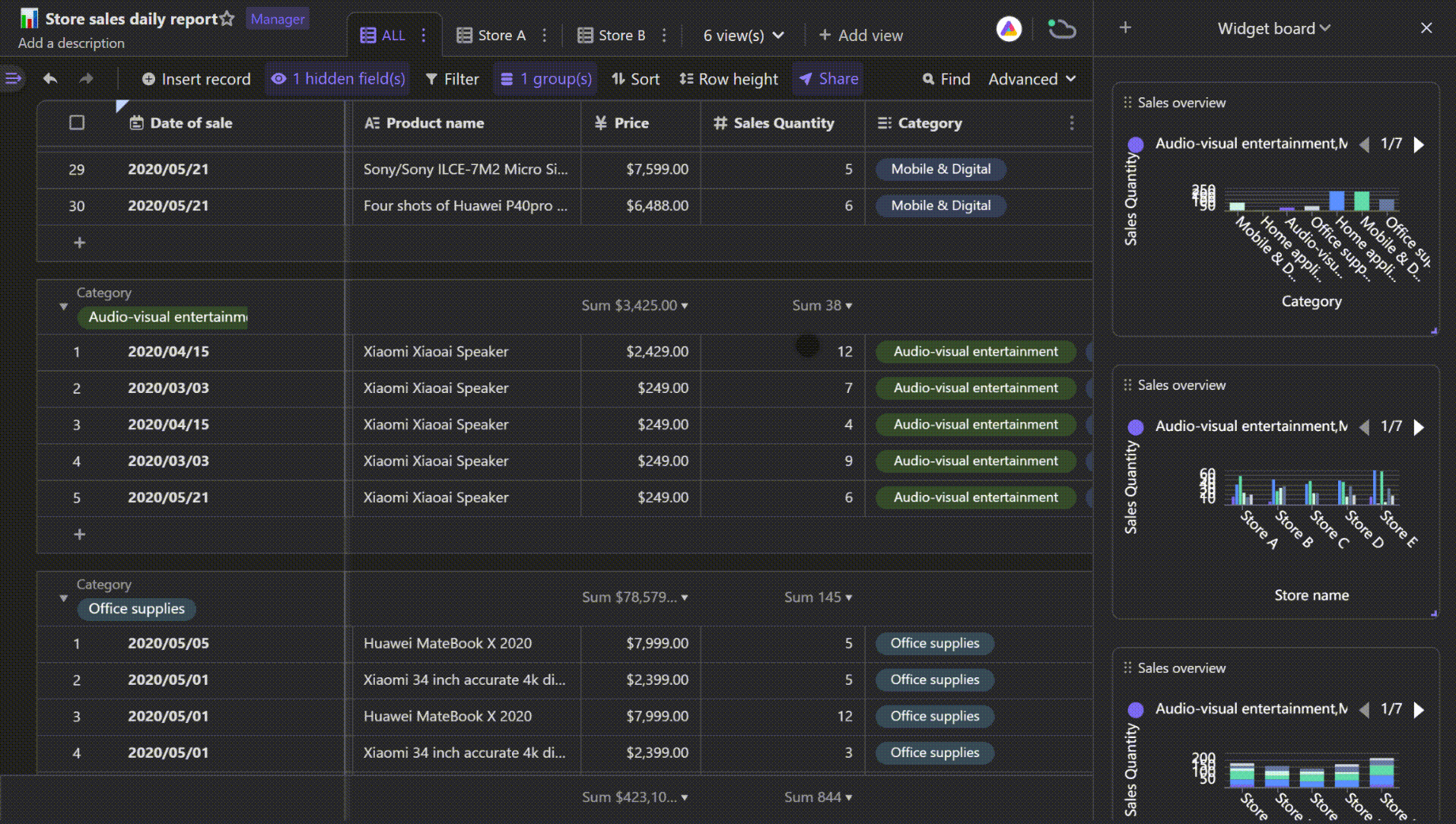
Picking a field for Y-axis
You need to pick a numeric field for your Y axis.
There are two ways for Y axis to plot your data.
Count all records: count and plot the number of records that have each X value on the Y-axis.
Count a field: plot all the values in a specific field, and you will have a choice of whether to aggregate your values with using functions of sum, maximum, minimum, and average.
Grouping by a field
You can choose to group your the values on X axis by a third field. You can select any field as the third field except attachment field.
Grouping is helpful for distinguishing the differences between groups.
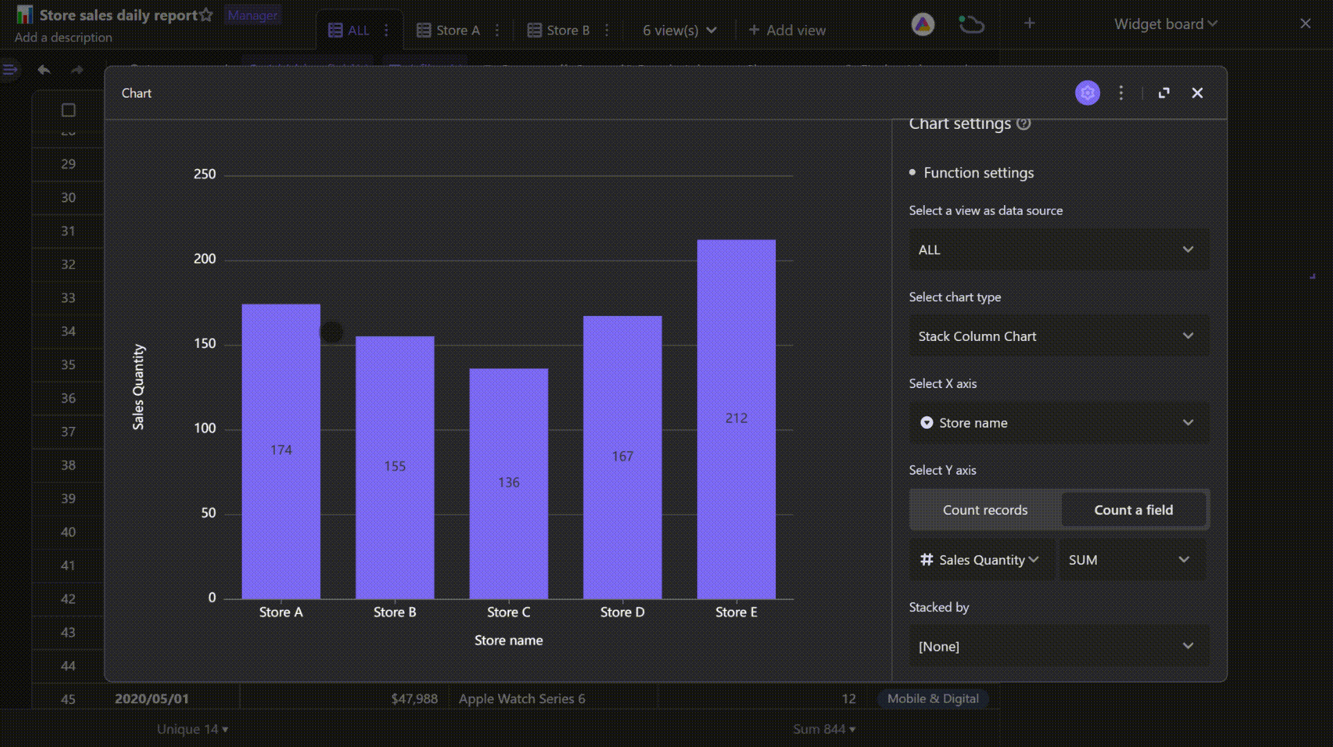
Stack chart
Stack chart helps you stack groups on top of each other.The difference between stacking and grouping is stacking group values with lying one on top of another.Only stack chart needs a third field to stack by.
There are several types of stack chart in AITable, including stack column chart, percent stack column chart, stack bar chart, and percent stack bar chart.
Regular stack chart
Displays stacked groups' exact quantities.
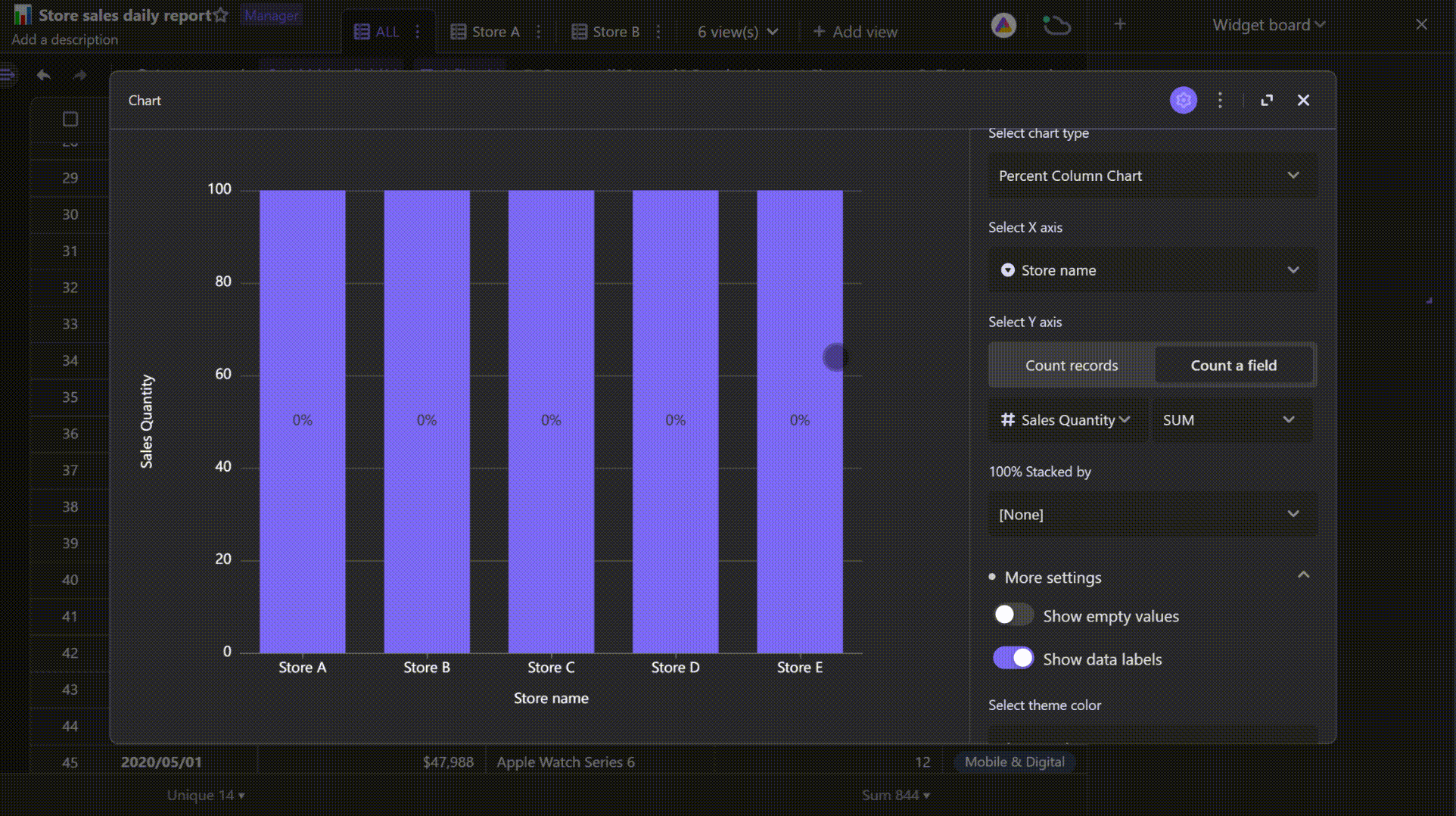
Percent stack chart
It shows the proportion of each group.
Aggregating scatter values
It's an option when you plot scatter chart.
When setting Y axis for counting a field, you can aggregate the field values to show the sum, minimum, maximum, or mean of all of the values.
More settings
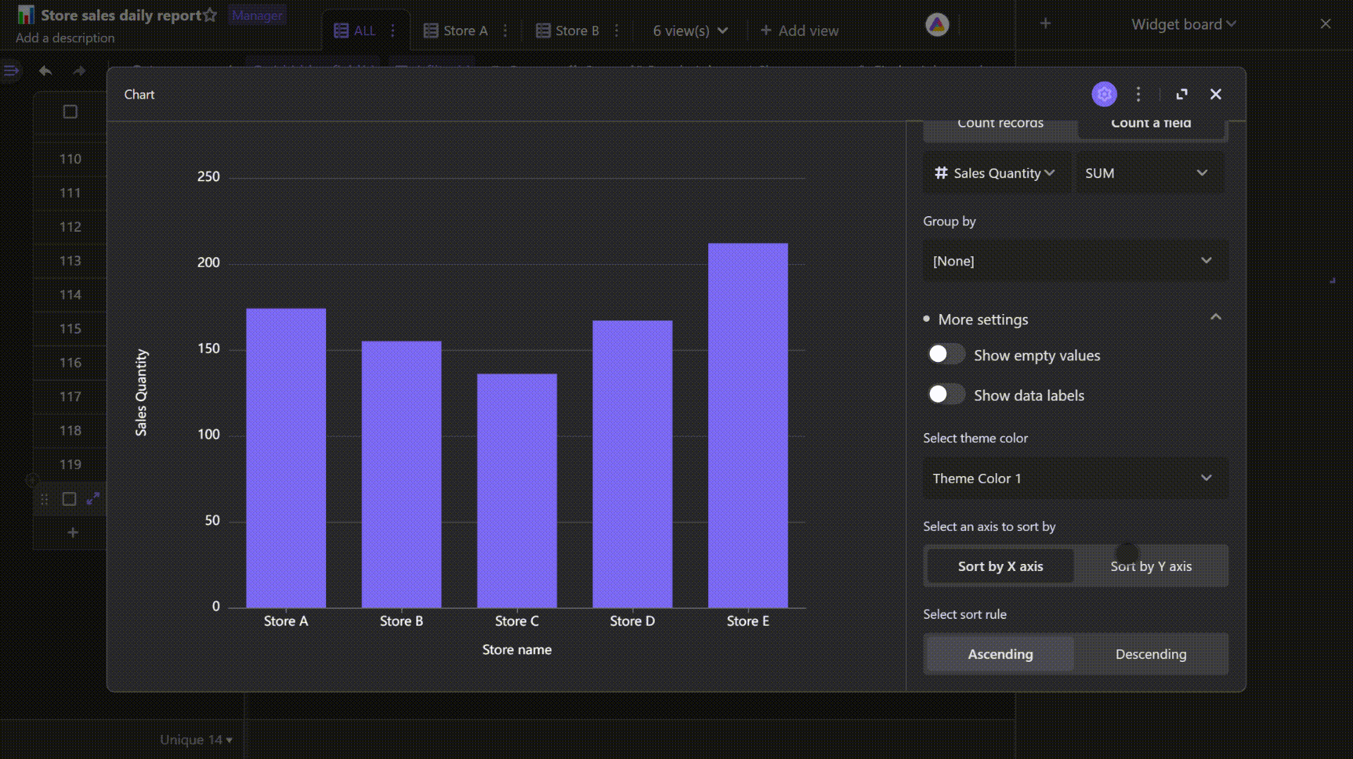
Show empty values
Toggle on the "Show empty values" setting, you will see a "None" group on X axis, which shows there are empty cells in the field you pick for X axis.
Show data labels
Toggle on the "Show data labels" setting, there will be data labels displayed on the chart.
Select theme color
There are two types of color schemes provided for theme, including the multicolor and the color gradient schemes.
A multicolor scheme colors the chart displaying multiple groups in the order of color blocks of the scheme.
A color gradient scheme colors the chart without grouping with the first color block of the scheme.
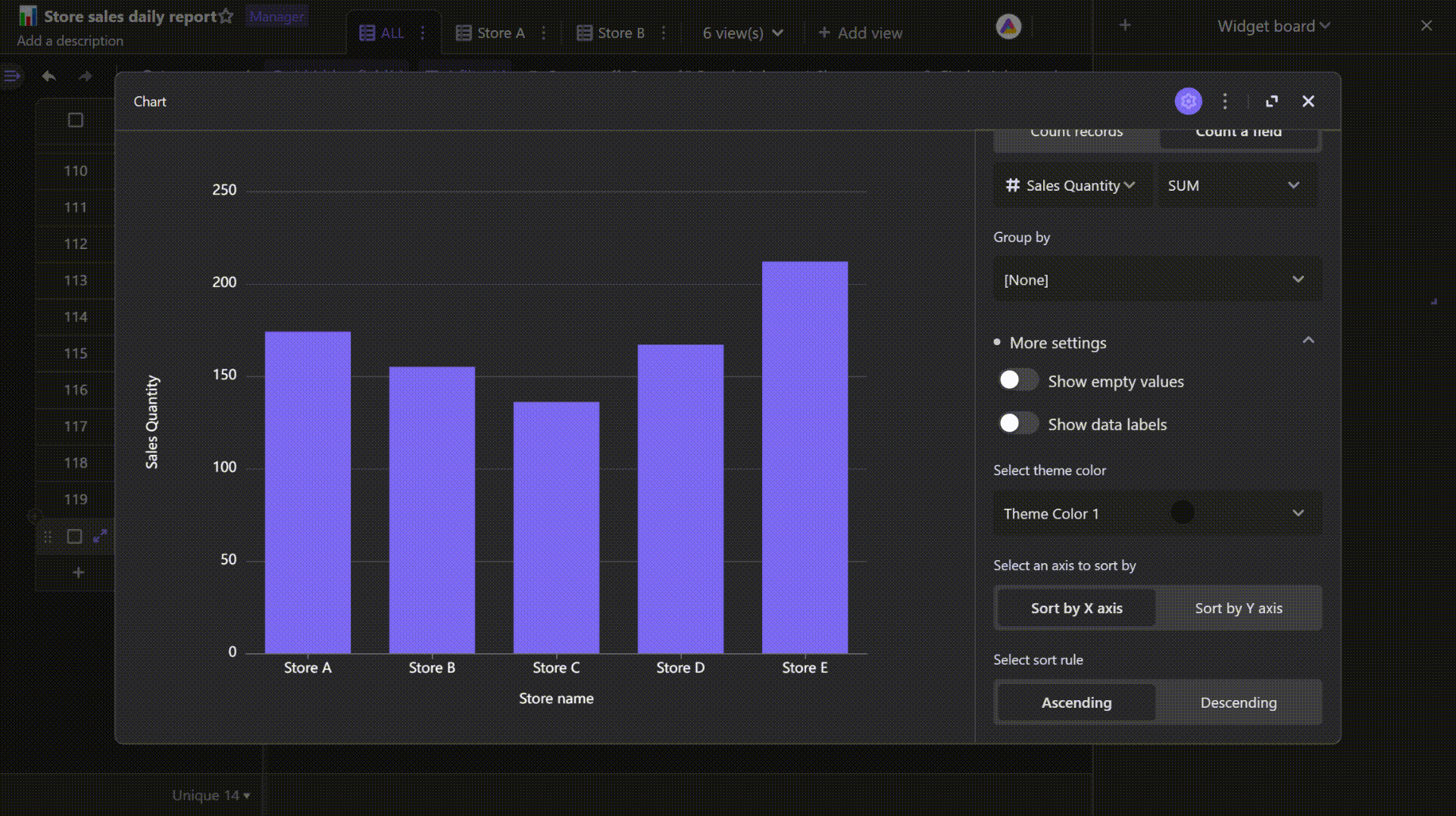
Set sorting
You can choose to sort using values in X axis or Y axis. Number type values will be sorted in numerical order of 1-9 or 9-1, while string type values will be sorted in alphabetical order of A-Z or Z-A.
Show smooth curve
This setting will only appear in the line chart settings, after toggling on it, the curve displayed will be smoother.