Chart Widget
Introduction
The "Chart" widget (hereinafter referred to as "Chart") can visualize the data in the datasheet into various display forms such as column charts, bar charts, line charts, scatter charts, and pie charts.You can intuitively understand the overview of the data through the "Chart", which is convenient for you to analyze data to make decisions and make meeting reports.
Add a widget
Method 1
Open a datasheet, click the "Widget" button on the right to expand the "Widget Panel", and then click the "Add Widget" button.
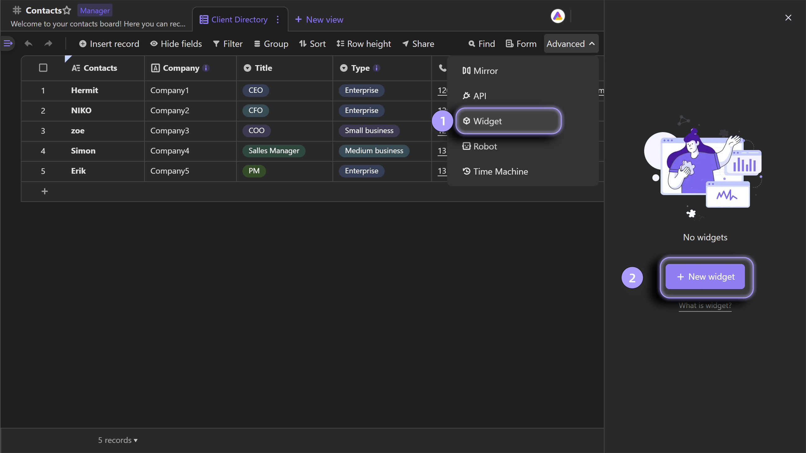
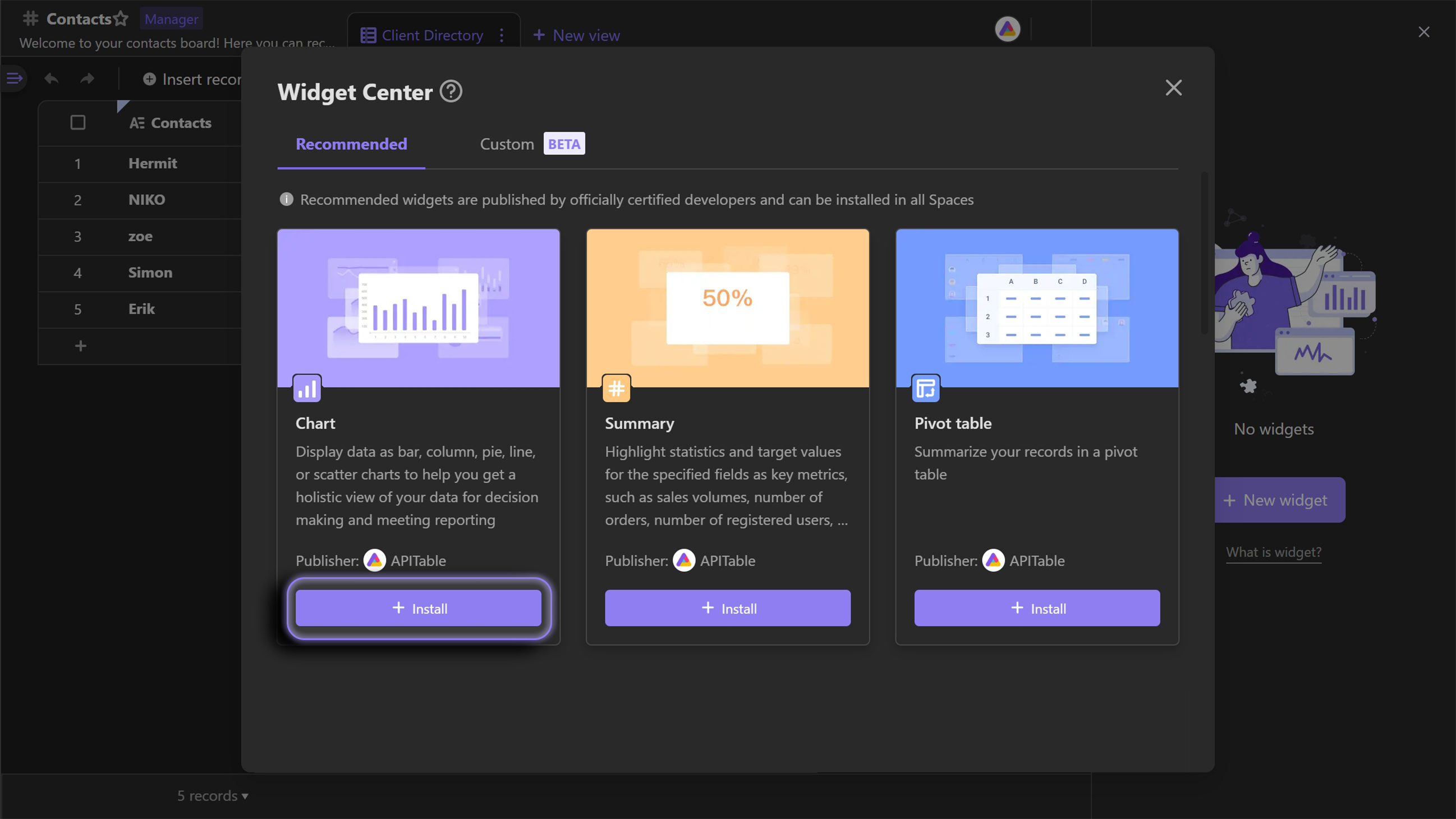
Add a "Chart" from the "Widget Center".
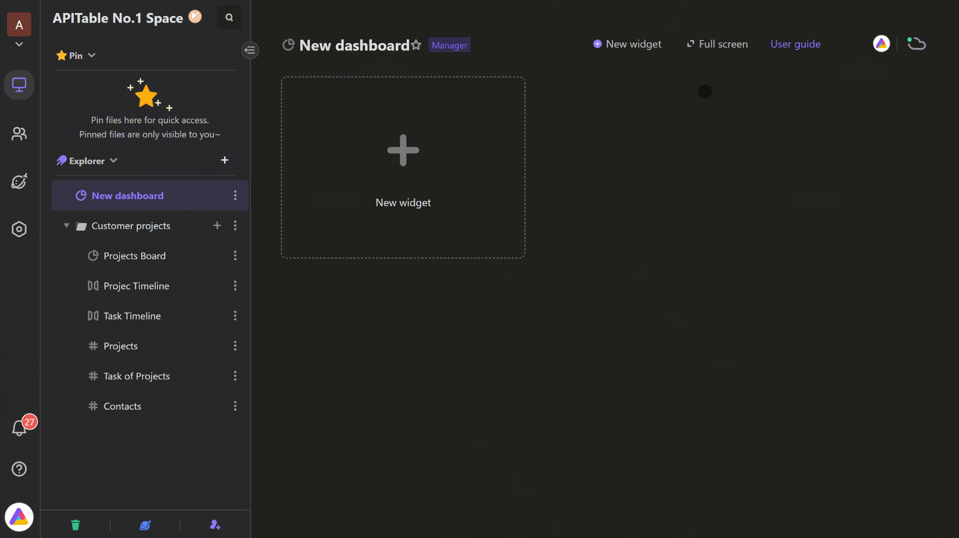
Method 2
Click the "Add Widget" button in the "Dashboard" to add a "Chart", you can choose "Import" or "Add" widget:
1. "Import" is to copy a "Chart" that has been generated in the datasheet to the dashboard;
2. "Add" is to create a new "Chart" in the "Dashboard".
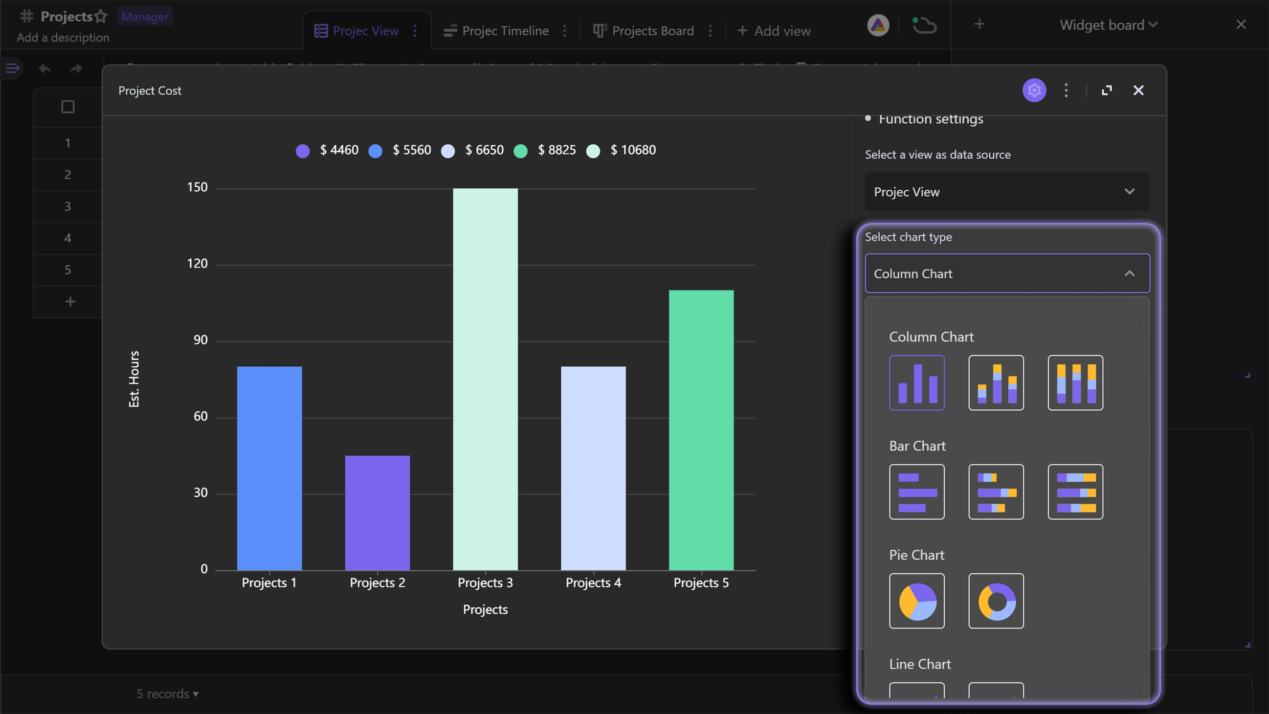
Types of charts
| Chart Type | Chart Description |
|---|---|
| Column Chart | Use the length of the rectangle as a variable to show the numerical comparison of different categories.Generally, the horizontal axis is the dimension, and the vertical axis is the numerical value. |
| Stacked Column Chart | An extended form of the "Column Chart", divides each column into small columns of different colors, and displays the proportion of sub-categories under the large category in a stacked form. |
| Percent Stacked Column Chart | An extended form of the "Column Chart", divides each column into small columns of different colors, and displays the proportion of sub-categories under the large category in the form of percentages. |
| Bar chart | Similar to the column chart, except that in Bar Chart, the vertical axis is the dimension, and the horizontal axis is the numerical value. |
| Stacked Bar Chart | An extended form of the "Bar Chart", divides each column into small columns of different colors, and displays the proportion of sub-categories under the large category in a stacked form. |
| Percent Stacked Bar Chart | An extended form of the "Bar Chart", divides each column into small columns of different colors, and displays the proportion of sub-categories under large categories in percentage. |
| Pie Chart | Display the classification and proportion of data through the color and area of the sector block. |
| Donut Chart | Similar to the pie chart, but with a blank space at the center of the circle to display aggregated values for all dimensions. |
| Line Chart | A graph that connects data points with straight lines, is suitable for showing the continuous trend of data over a certain period of time. |
| Stacked Line Chart | An extended form of the "Line Chart", divides a line into small lines of different colors, and displays the proportion of sub-categories under the large category in a stacked form. |
| Scatter Chart | Distributes data as points in a Cartesian coordinate system to find the relationship between two variables (X and Y axes).Suitable for comparison of large amounts of data. |
For the applicable scenarios of each chart, please refer to "Chart Mini Program Graphics Detailed Explanation"
Configure the widget
Take the Column chart as an example: After we create a new "Chart" in the "Widget Panel", the system will configure and render a basic column chart by default.If you need to customize the chart, open the "Chart settings" menu to configure it.
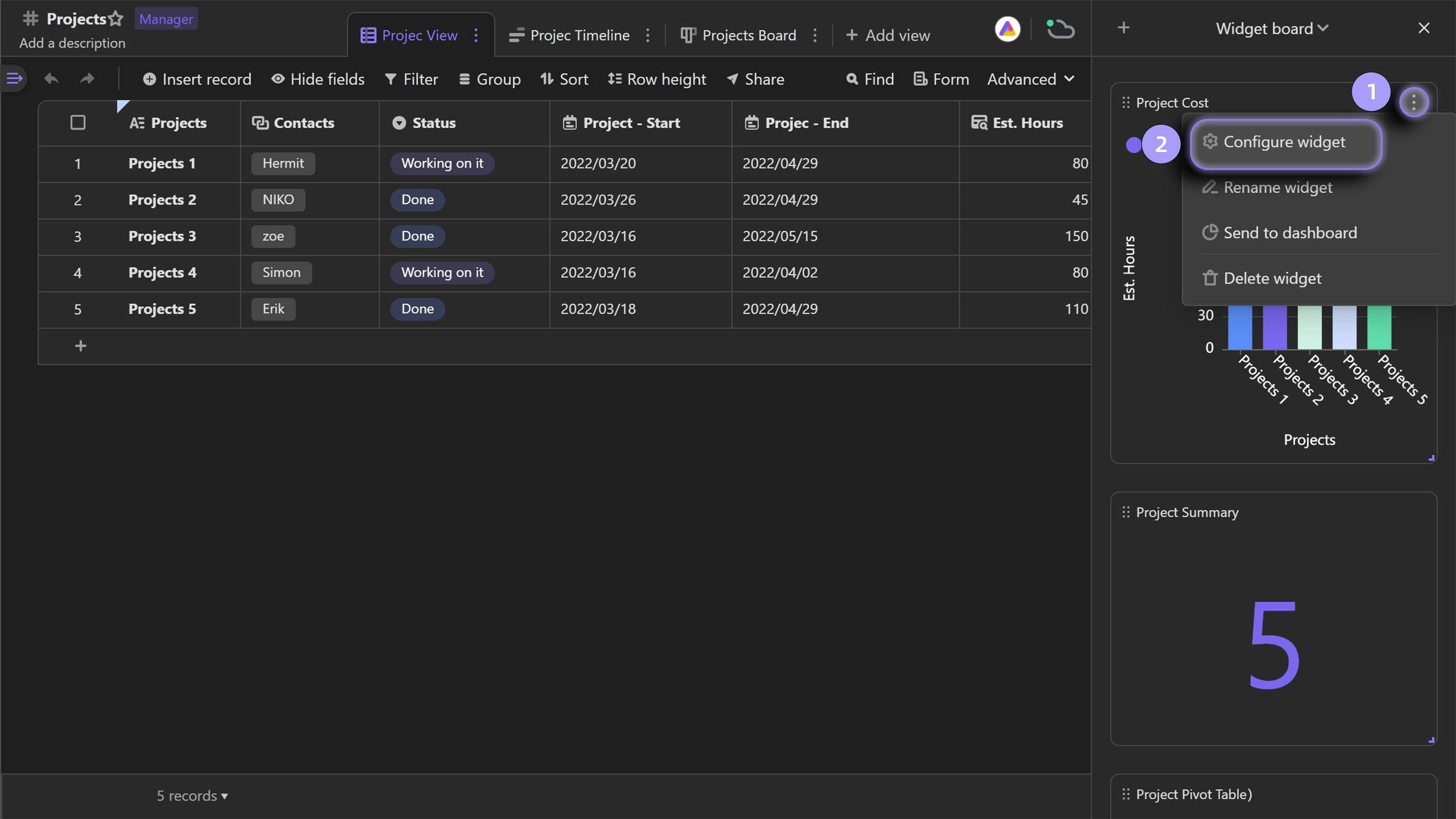
The "Chart settings" menu contains two sections: "Function settings" and "More settings"."Function settings" determines the structure of a "chart", and "More settings" determines the style of a chart, so if you want to quickly render a chart, you only need to adjust the "Function settings".
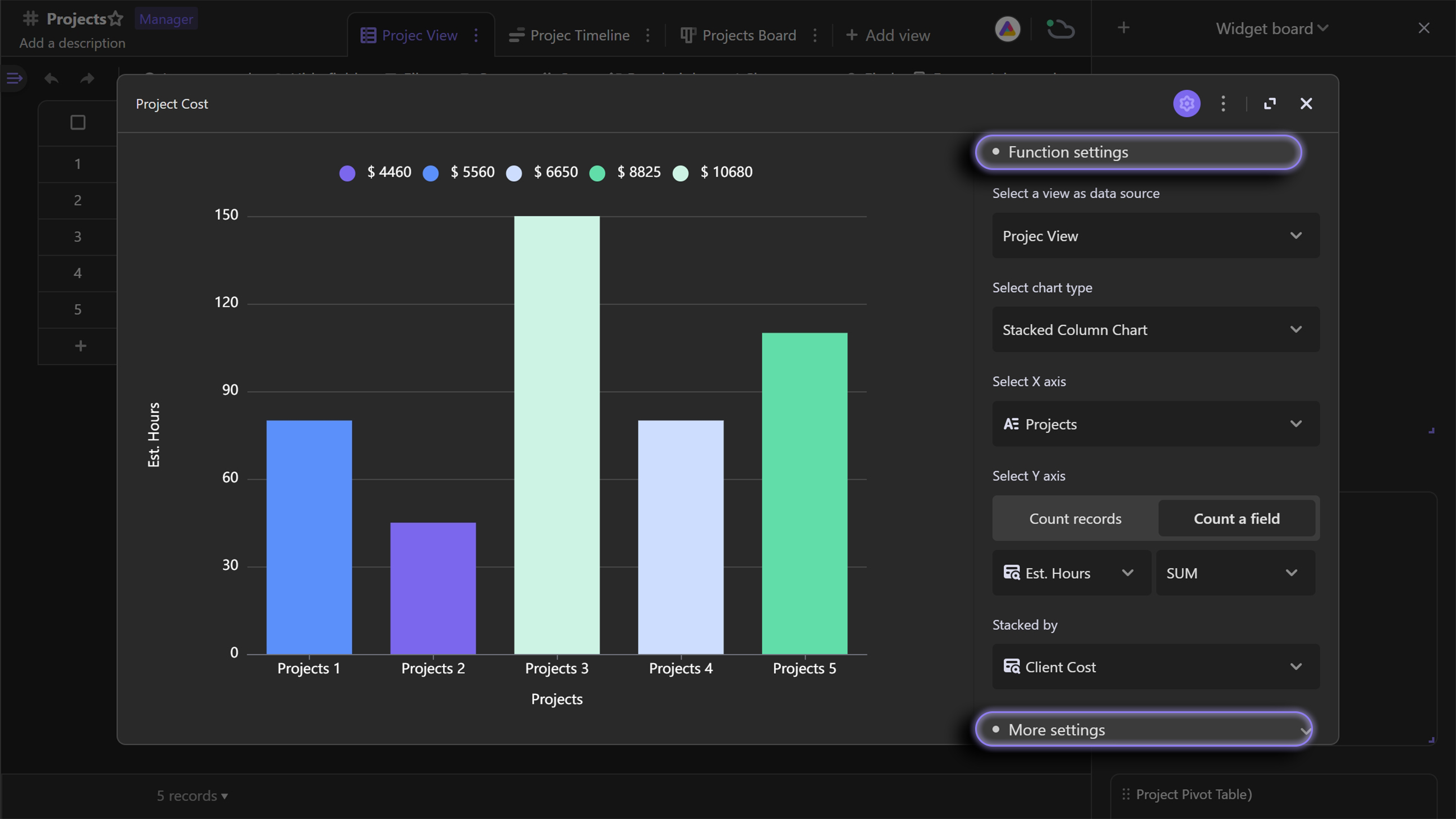
Select view
You can select an existing view in the datasheet from the drop-down menu in the "Select a view as the data source ".The data rendered on the chart is affected by the filter items of the selected view.If some data is filtered by the corresponding view filter, it will not be rendered on the chart.
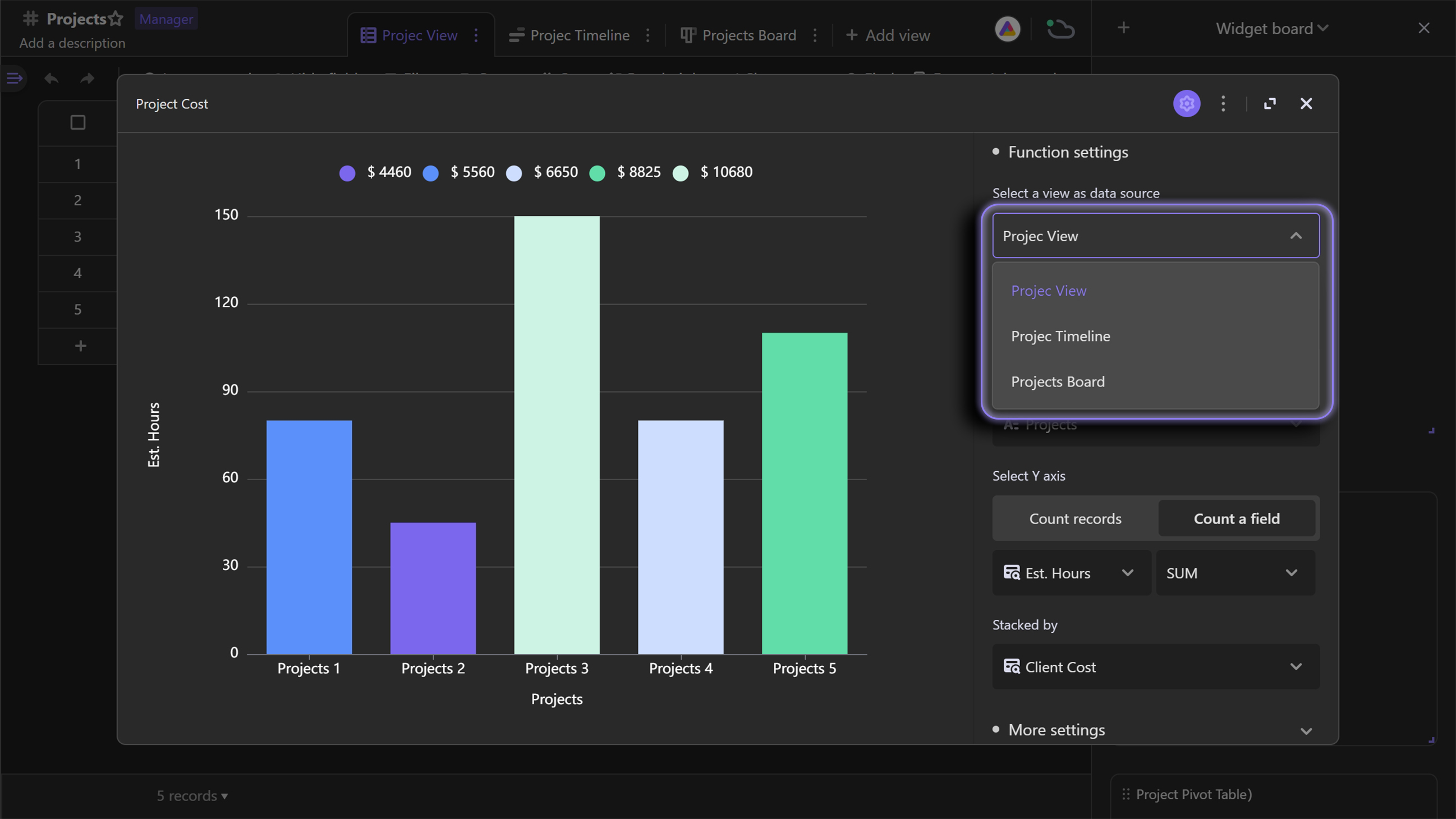
Chart type
You can switch chart types in the "Select chart type".Optional charts include Column, Stacked Column, Percent Stacked Column, Bar, Stacked Bar, Percent Stacked Bar, Pie, Donut, Line, Stacked Line, Scatter Charts, etc.Choose the appropriate chart to describe the data better.
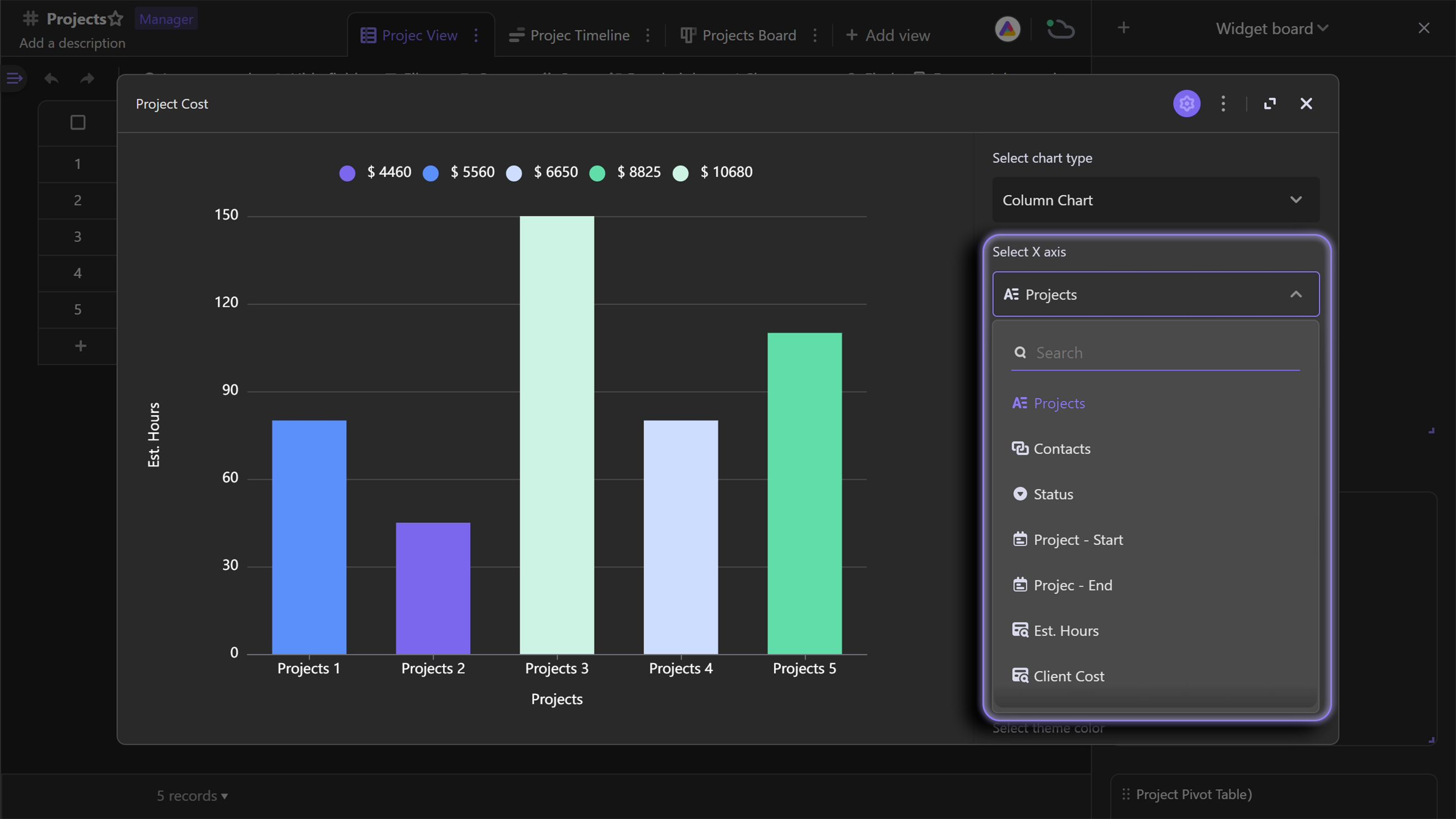
Configure the x-axis
To specify the angle of the analysis data, which corresponds to the X-axis of the Column Chart.You can toggle existing fields in the datasheet as the X-axis in the drop-down menu.
Configure the y-axis
To quantify dimensions, which can count the summary results of different dimensions, corresponding to the y-axis of the column chart. There are two ways to count:
Method one
Count records: count the number of records under each category of the corresponding dimension;
Method two
Count a field: count the summary results of a field, and you can also set statistical rules: sum, max, min, and average.
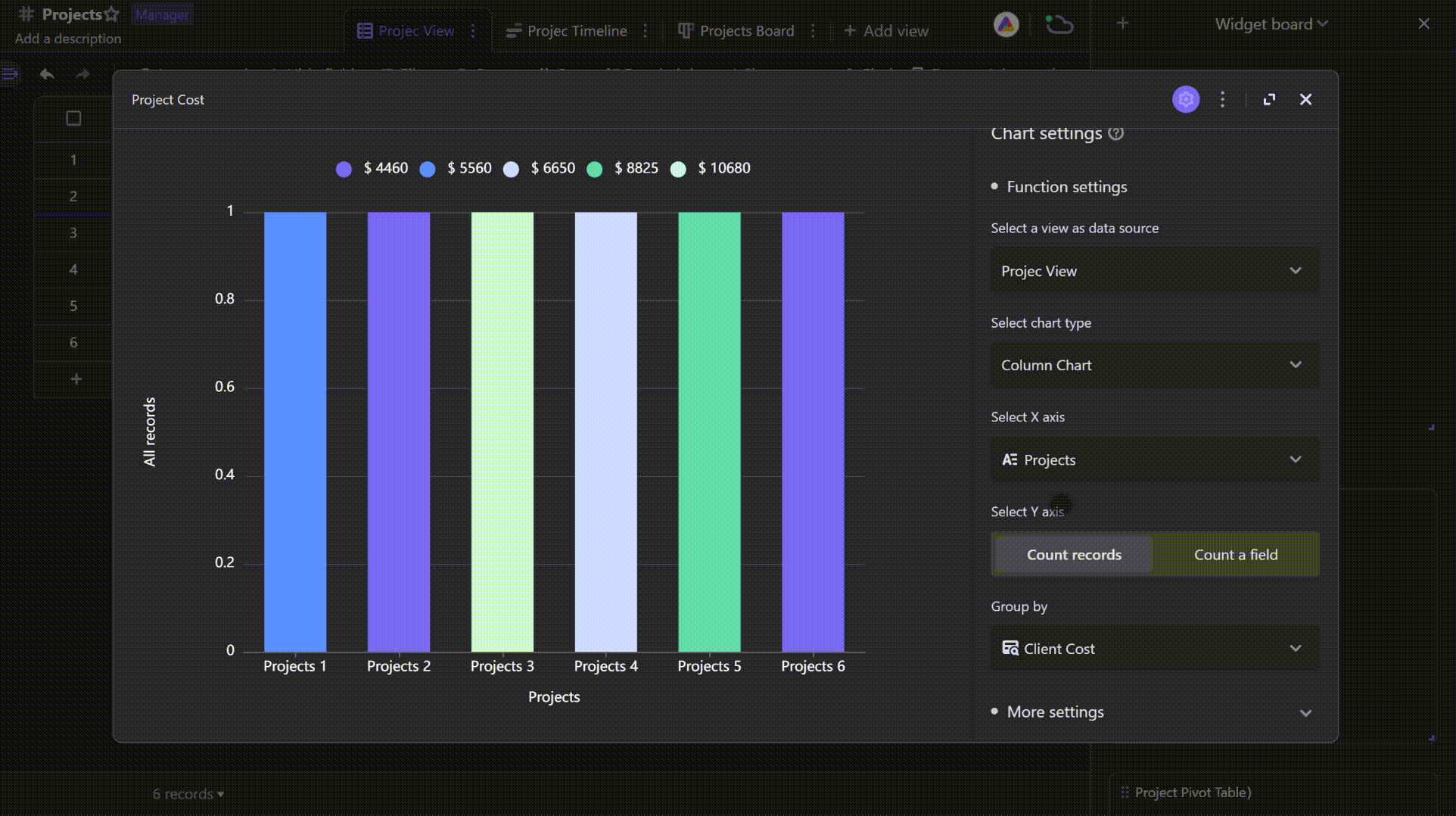
After configuring the above four settings, you can quickly render a meaningful column chart.
To view all the configurations of "Charts", please see Detailed Explanation of Chart Configurations
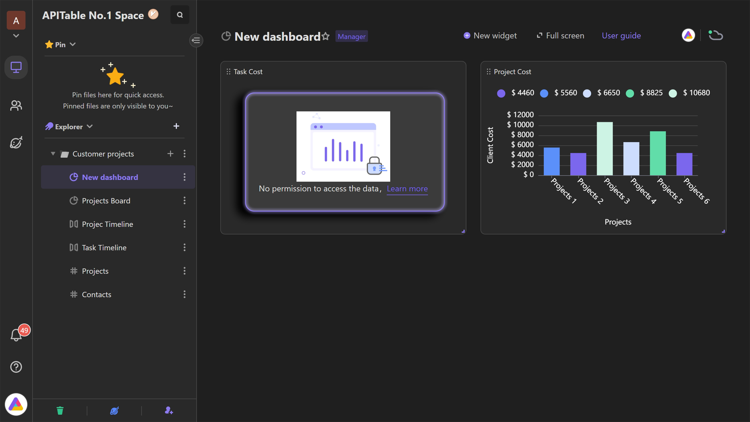
View widget
Space members must have the reading permission of the associated datasheet (data source) bound to "Charts" to view the charts in the widget.
For example, the chart "Product Sales Quantity" in the dashboard is bound to the data source "Store Sales Daily", a member only has the reading permission of the dashboard and not the reading permission of the associated datasheet (data source) cannot view the chart in the dashboard, and the system will display a prompt for access denied.
Learn more
Detailed Explanation of chart types in Chart Widget Detailed Explanation of Chart Configurations