Funnel Widget
Funnel Chart is suitable for single-process one-way analysis where the business process is relatively standardized, long-period, and has many links. Through Funnel Chart, you can visually find out which link in the business data of each link has problems so that you can optimize it.
Usage Scenarios
- Scenario 1: Conversion rate analysis of customer email / SMS marketing
- Conversion funnel: number of marketing SMS sent → number of successful delivery → number of SMS opened → number of clicks on the links attached to the SMS
- Scenario 2: AARRR User Lifecycle Conversion Rate Analysis
- Conversion funnel: user acquisition → user activation → user retention → gaining revenue → referral spread
- Scenario 3: Sales lead conversion rate analysis
- Conversion funnel: number of the market leads → number of confirmed intention customers → number of business negotiations → number of completed signings
In summary, if the various segments of a business are relatively fixed and you want to understand the conversion effect of each segment, using Funnel Charts is a very intuitive way to do so.
How to use the Funnel Chart
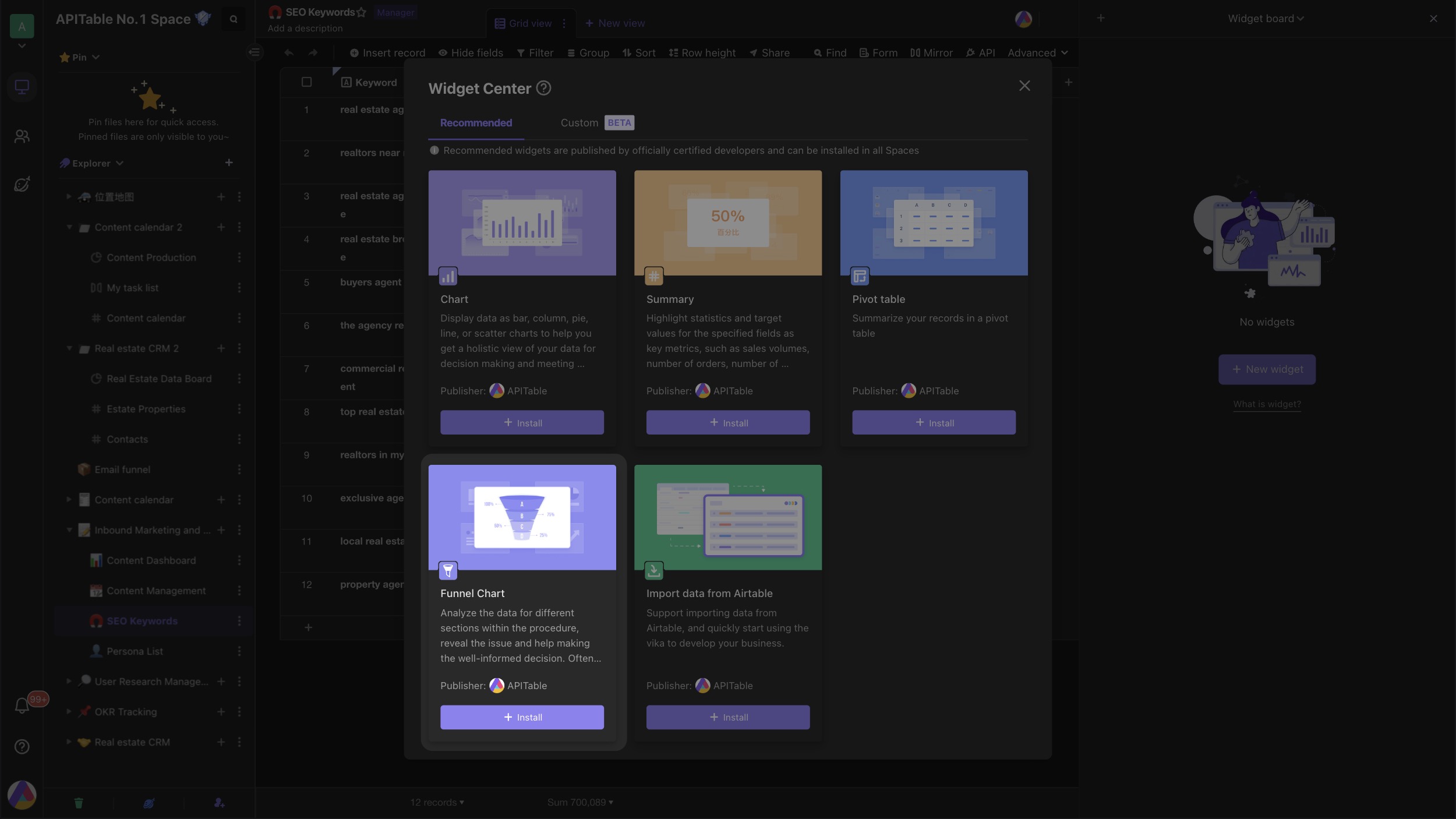
Install the widget
Open the "Widget Center" and choose "Funnel Chart" to install.
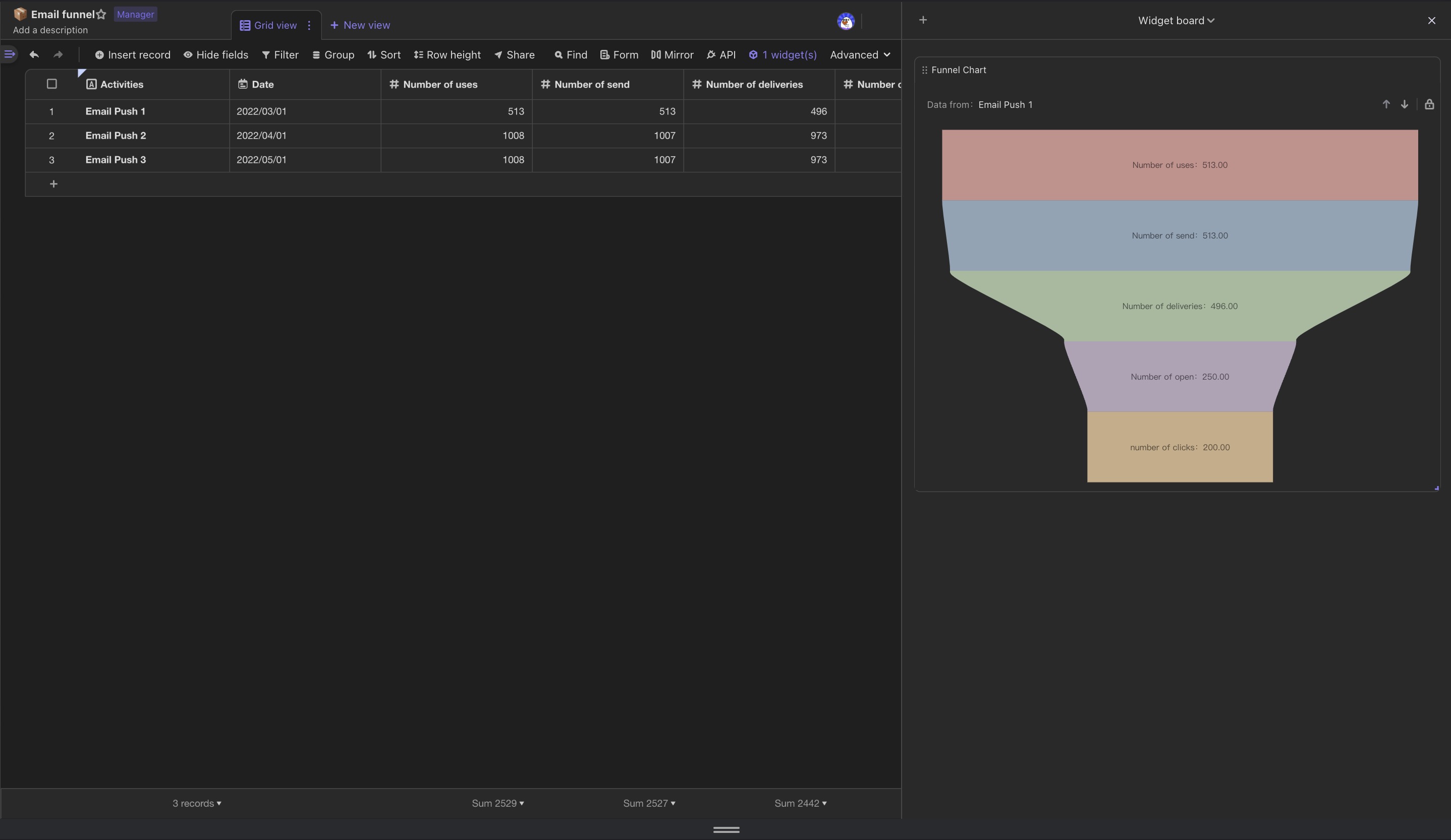
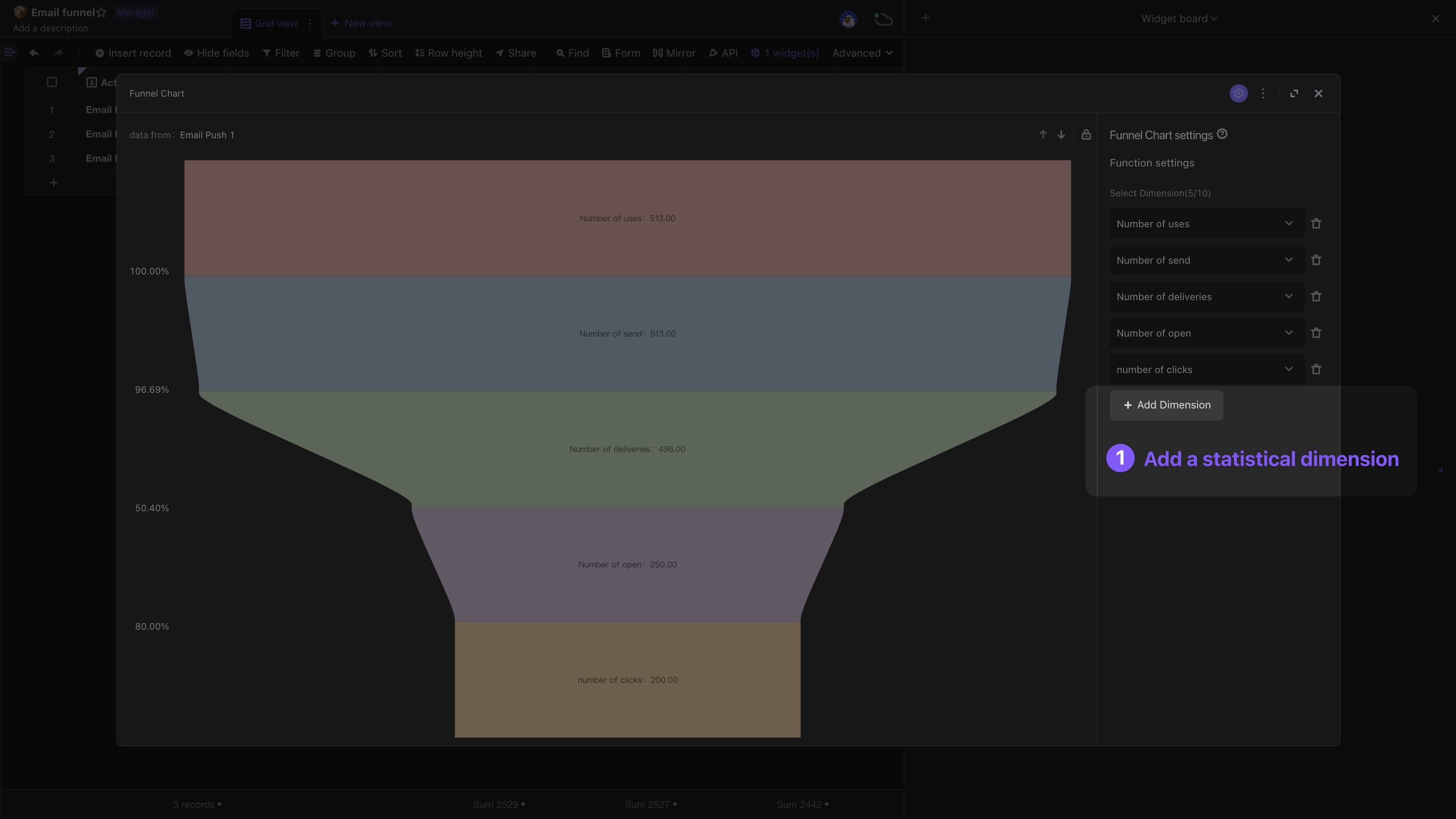
By default, the system automatically sets the columns of the "Number" type in the datasheet as the dimensions of the Funnel Chart.The dimension represents the classification of each level of the Funnel Chart from top to bottom.
The system will configure up to 5 dimensions for you by default, and you can add more dimensions manually.
Configure the widget
Click the Expand button to expand the widget, which is divided into configure area and chart area.
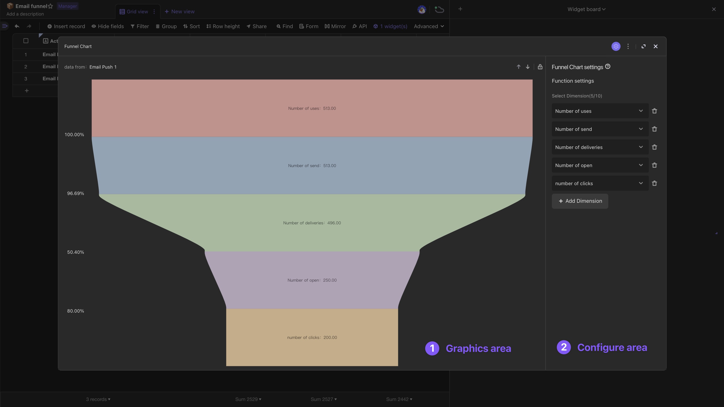
You can add dimensions (up to 10) in the settings, and the system will read the values in the dimensions from top to bottom, and then render them in a trapezoidal funnel chart in proportion to their size.
Tip: It needs to be a "number" field type
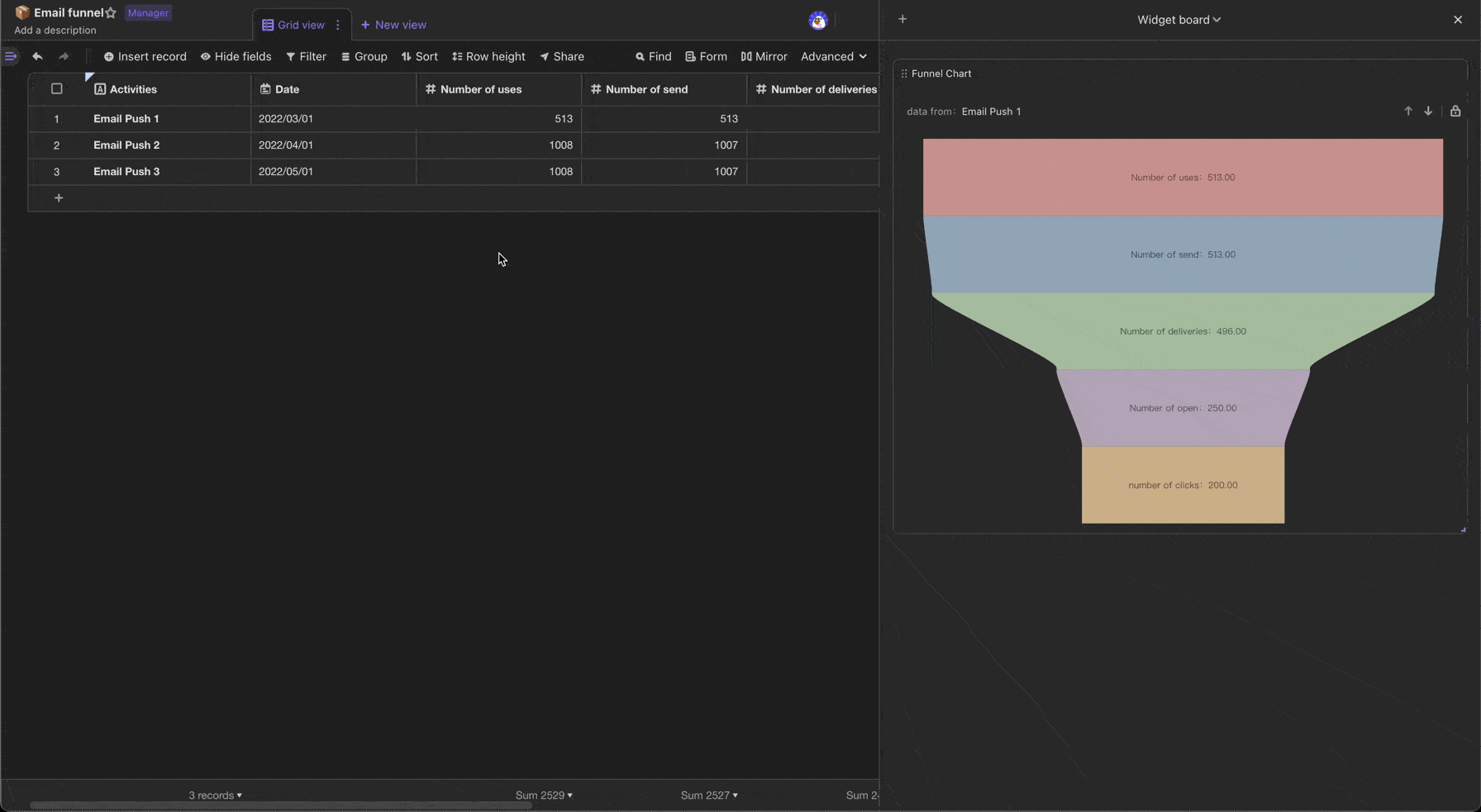
View Funnel Chart
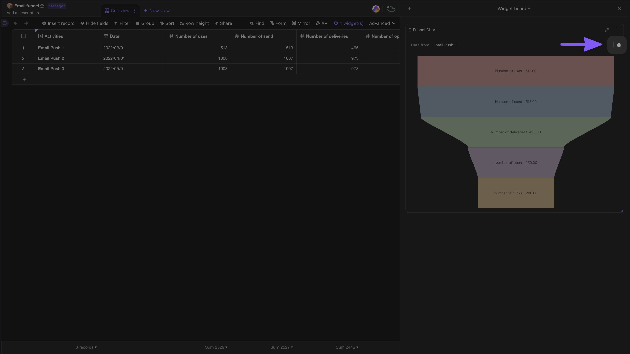
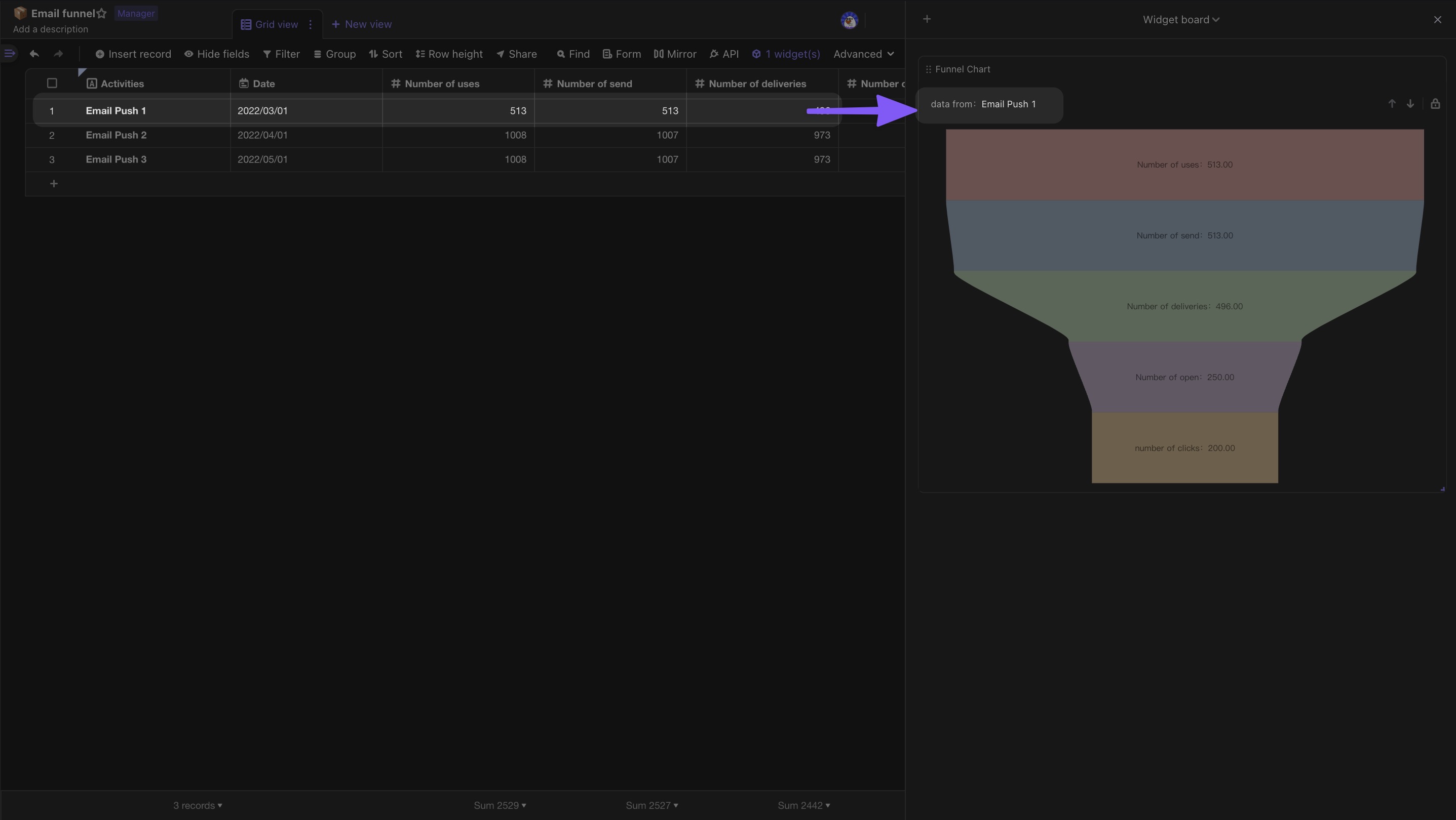
You can click on a cell and the system will render the record as a funnel chart; you can also box multiple rows and the system will sum the data and render it as a funnel chart.
On the expanded widget, you can switch the record with the previous/next button in the chart area.
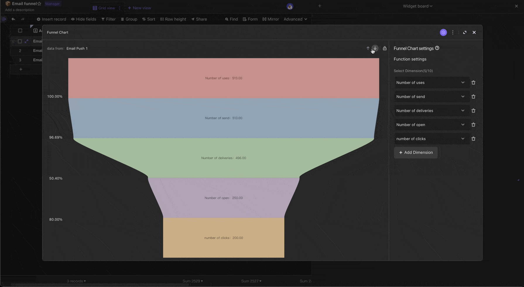
The main record information of this funnel chart is displayed in the upper left corner of the chart area.
When you click "Lock", switching records and selections will be temporarily disabled, but the rendered data will still be updated in real-time.
You can complete your BI reporting by "locking" >> sending to "dashboard".